フラッタードロップダウンの例
Flutter では、ドロップダウン ウィジェットを使用してオプションのリストをユーザーに提供します。 このウィジェットは、ユーザーが選択肢のリストからオプションを選択する必要があるフォームでよく使用されます。 ドロップダウン ウィジェットは使いやすく、ユーザーがオプションを選択するための洗練された直感的な方法を提供します。
ドロップダウン ウィジェットの作成
Flutter でドロップダウン ウィジェットを作成するのは簡単です。 ドロップダウン ウィジェットを作成するには、リストに表示されるオプションを指定する必要があります。 ドロップダウン ウィジェットを作成する方法の例を次に示します。
String dropdownValue = 'One';

DropdownButton<String>(
  value: dropdownValue,
  icon: Icon(Icons.arrow_downward),
  iconSize: 24,
  elevation: 16,
  style: TextStyle(color: Colors.deepPurple),
  underline: Container(
    height: 2,
    color: Colors.deepPurpleAccent,
  ),
  onChanged: (String newValue) {
    setState(() {
      dropdownValue = newValue;
    });
  },
  items: <String>['One', 'Two', 'Three', 'Four']
      .map<DropdownMenuItem<String>>((String value) {
    return DropdownMenuItem<String>(
      value: value,
      child: Text(value),
    );
  }).toList(),
);
この例では、「DropdownButton」ウィジェットが作成され、「value」パラメータが「dropdownValue」に設定されます。 items パラメータは、ドロップダウン リストに表示される文字列のリストです。 onChanged パラメータは、ユーザーがリストからオプションを選択したときに呼び出される関数に設定されます。
ドロップダウン ウィジェットのカスタマイズ
ドロップダウン ウィジェットは、アプリのスタイルとデザインに合わせてカスタマイズできます。 ドロップダウン ウィジェットをカスタマイズする方法の例をいくつか示します。
ドロップダウン ボタンのアイコンを変更する
ドロップダウン ボタンに表示されるアイコンを変更するには、icon パラメーターを使用します。 以下に例を示します。
DropdownButton<String>(
  value: dropdownValue,
  icon: Icon(Icons.arrow_forward),
  items: <String>['One', 'Two', 'Three', 'Four']
      .map<DropdownMenuItem<String>>((String value) {
    return DropdownMenuItem<String>(
      value: value,
      child: Text(value),
    );
  }).toList(),
  onChanged: (String newValue) {
    setState(() {
      dropdownValue = newValue;
    });
  },
);
この例では、「icon」パラメータが「Icons.arrow_forward」アイコンを持つ「Icon」ウィジェットに設定されています。
ドロップダウン ボタンの色の変更
ドロップダウン ボタンの色を変更するには、style パラメータを使用できます。 以下に例を示します。
DropdownButton<String>(
  value: dropdownValue,
  style: TextStyle(color: Colors.red),
  items: <String>['One', 'Two', 'Three', 'Four']
      .map<DropdownMenuItem<String>>((String value) {
    return DropdownMenuItem<String>(
      value: value,
      child: Text(value),
    );
  }).toList(),
  onChanged: (String newValue) {
    setState(() {
      dropdownValue = newValue;
    });
  },
);
この例では、style パラメータは TextStyle オブジェクトに設定され、color は Colors.red に設定されます。
その他の例
これはフラッター ドロップダウンの例です。 ドロップダウンを通じて 1 つ以上の項目を選択できます。 通常、ドロップダウンは、グリッドビューやリストビューなどのデータのリストを表示する他のタイプのウィジェットよりも小さなスペースを占めます。
この例では依存関係は必要ありません。
(a)。 メインダーツ
これは、このプロジェクトで作成する必要がある唯一のファイルです。
まずインポートを追加します。
import 'package:flutter/material.dart';
その「material.dart」により、ドロップダウンを含む、使用するいくつかのフラッター マテリアル デザイン コンポーネントにアクセスできます。
MyAppState を作成し、状態クラスを拡張します。 MyApp は、状態が作成されるカスタム StatefulWidget です。
class MyAppState extends State<MyApp> {
このクラス内で、ドロップダウンに表示される項目のリストを定義します。
List _fruits = ["Apple", "Banana", "Pineapple", "Mango", "Grapes"];
次に、ドロップダウン メニュー項目のリストと選択した項目を保持する文字列を含む 2 つのインスタンス フィールドをさらに追加します。
  List<DropdownMenuItem<String>> _dropDownMenuItems;
  String _selectedFruit;
次に、initState() クラスをオーバーライドします。
void initState() {
_dropDownMenuItems = buildAndGetDropDownMenuItems(_fruits);
_selectedFruit = _dropDownMenuItems[0].value;
super.initState();
}
ドロップダウン メニュー項目を構築して取得するメソッドは次のとおりです。
  List<DropdownMenuItem<String>> buildAndGetDropDownMenuItems(List fruits) {
    List<DropdownMenuItem<String>> items = new List();
    for (String fruit in fruits) {
      items.add(new DropdownMenuItem(value: fruit, child: new Text(fruit)));
    }
    return items;
  }
ドロップダウン項目を変更する方法は次のとおりです。
    void changedDropDownItem(String selectedFruit) {
    setState(() {
      _selectedFruit = selectedFruit;
    });
  }
最後に build() メソッドをオーバーライドします。
Widget build(BuildContext context) {
return new MaterialApp(
debugShowCheckedModeBanner: false,
home: new Scaffold(
appBar: new AppBar(
title: new Text("DropDown Button Example"),
),
body: new Container(
child: new Center(
child: new Column(
crossAxisAlignment: CrossAxisAlignment.center,
mainAxisAlignment: MainAxisAlignment.center,
children: <Widget>[
new Text("Please choose a fruit: "),
new DropdownButton(
value: _selectedFruit,
items: _dropDownMenuItems,
onChanged: changedDropDownItem,
)
],
)),
),
),
);
}
main.dart の完全なコードは次のとおりです。
import 'package:flutter/material.dart';
void main() => runApp(new MyApp());
class MyApp extends StatefulWidget {
State<StatefulWidget> createState() {
return new MyAppState();
}
}
class MyAppState extends State<MyApp> {
List _fruits = ["Apple", "Banana", "Pineapple", "Mango", "Grapes"];
List<DropdownMenuItem<String>> _dropDownMenuItems;
String _selectedFruit;
void initState() {
_dropDownMenuItems = buildAndGetDropDownMenuItems(_fruits);
_selectedFruit = _dropDownMenuItems[0].value;
super.initState();
}
List<DropdownMenuItem<String>> buildAndGetDropDownMenuItems(List fruits) {
List<DropdownMenuItem<String>> items = new List();
for (String fruit in fruits) {
items.add(new DropdownMenuItem(value: fruit, child: new Text(fruit)));
}
return items;
}
void changedDropDownItem(String selectedFruit) {
setState(() {
_selectedFruit = selectedFruit;
});
}
Widget build(BuildContext context) {
return new MaterialApp(
debugShowCheckedModeBanner: false,
home: new Scaffold(
appBar: new AppBar(
title: new Text("DropDown Button Example"),
),
body: new Container(
child: new Center(
child: new Column(
crossAxisAlignment: CrossAxisAlignment.center,
mainAxisAlignment: MainAxisAlignment.center,
children: <Widget>[
new Text("Please choose a fruit: "),
new DropdownButton(
value: _selectedFruit,
items: _dropDownMenuItems,
onChanged: changedDropDownItem,
)
],
)),
),
),
);
}
}
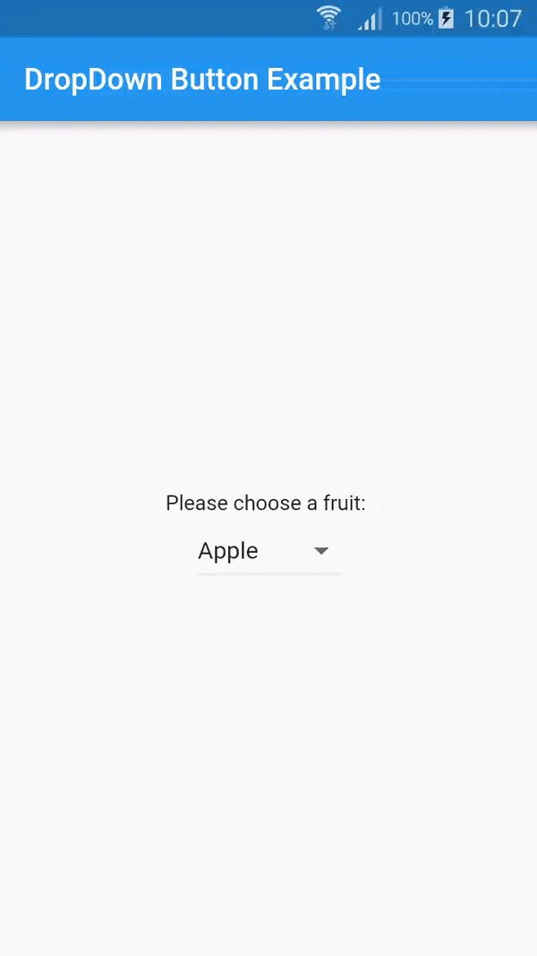
### デモ
こちらがデモです
上記のコードのライセンスは Apache バージョン 2.0 です。
結論
ドロップダウン ウィジェットは、ユーザーにオプションのリストを提供するために使用される Flutter の重要なウィジェットです。 このウィジェットは使いやすく、アプリのスタイルやデザインに合わせてカスタマイズできます。 提供されている例を使用すると、アプリの要件を満たすドロップダウン ウィジェットを作成できます。